ShopDreamUp AI ArtDreamUp
Deviation Actions
Badge Awards
Description
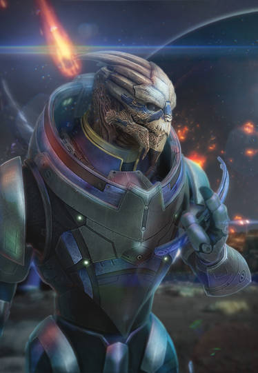
"Wait!"
He turned. "What?"
"I don't want to die."
He began walking.
"I know I'm being selfish -- but I don't want this to be the end. I don't want to die before I've really lived."
--
Piece featuring 's and my OCs. Finally figured out how to get pressure settings on tablet.
Revisited the pose of earlier drawings.
Inked by hand (pigment pens and brush pen), coloured in Photoshop CS3.
Mass Effect and its elements (c) Bioware
He turned. "What?"
"I don't want to die."
He began walking.
"I know I'm being selfish -- but I don't want this to be the end. I don't want to die before I've really lived."
--
Piece featuring
Revisited the pose of earlier drawings.
Inked by hand (pigment pens and brush pen), coloured in Photoshop CS3.
Mass Effect and its elements (c) Bioware
Image size
1350x1215px 229.03 KB
Comments39
Join the community to add your comment. Already a deviant? Log In
First, allow me to say I like this drawing quite a lot.
The overall composition, colour palette and pose work for me. It has a end-of-days mood to it that speaks to me.
I like what we can see of the background, the deliberate vagueness and the menacing shape to the right. I also appreciate the light effect from the right upper corner.
The characters have nice, clean lines, and, in my opinion, just the right level of detail to stand out from the background. There are some details that I really like - the metal ornament on the right one's cheek and the two clasps on his mandible are pretty, although I'd have liked a bit more highlight on the two clasps. The glowing accents on his armour are in my opinion nicely done, and I would have liked to see something similar on the other one, too, just one or two dots of colour to make their armour look as detailed as the other one's. In principle I like the patterning on the left one's face, although I'm not convinced that the straight geometrical lines work on the whole of his face - I'd have expected the line on his brow to either curve a tiny bit more to follow the structure beneath or - if it's really painted on straight - have a tiny bit more shading in the blue there, because the surface is not flat, I think. The same goes, to a smaller degree, for the mandible. On the fringe, it works well. I'm not quite sure what to make of the darker spots on his forehead. First thought it was blood, but there's some darker blue there on the mandible near the tip, too, that I can't resolve as shading, so I'm not sure.
I don't know anything about them or any detail about the situation they are in, but from their pose there's quite some emotion involved - the open-handed touch of the left one on the right one's face seems very light and hesitant, which seems to make this more than just despair. I like how he has his eye closed, although I'd have expected his eyelids to be darker than the surrounding area.
The right one seems frightened and/or stunned, going by the expression in their eye, and the pose of the hand looks natural to me.
I admit - and that's probably just me - that I can't completely imagine the shape of the left one's armour in the chest section - the other one is partially leaning in there, but I can't quite resolve whether he's leaning his face over it or not.
The right one's face is interesting,and I like their nose, but I'm not sure where the lowermost spike comes from - the mandible, probably. The headwrap is beautiful and the folds look soft. The colour of their face gets a bit lost against the background, but maybe that way the white on the other one's face is more noticeable. Not sure about it, but maybe a tiny highlight in the eye would have drawn even more attention to it, but it already works for me.
Colour-wise, i'd have liked to see more shadow inside the inner round of the right one's armour and on the black edge of the left one's armour. Maybe a tiny bit more shadow on the left one's neck plates where they overlap.
I love the reflections of orange glow on both their armours and faces.
The yellow floating bits - I assume they are some burning particles from the fire in the background. I like how they give some motion and direction to the scene and contrast with the stillness of the two characters, but I'd have preferred them either smaller or with a bit dark and light to give them a hint of structure, like embers.
<img src="e.deviantart.net/emoticons/s/s…" width="15" height="15" alt="
Okay, I think I've nit-picked enough. I really, really like this one, and I'd love to see a bigger version of it.


![So in love [commission]](https://images-wixmp-ed30a86b8c4ca887773594c2.wixmp.com/f/86fdc695-d34f-4852-ba5e-5226ad0819d2/d921g6d-1ea0d9b6-6ed5-49f1-84ec-0cbd34f5524a.png/v1/crop/w_184)


