ShopDreamUp AI ArtDreamUp

Deviation Actions


Description
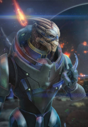
DUST by Tirion
Formal Collection
Palaven | Illium | Citadel
--
Last of the faux advertisements. Oh by the fricking Spirits this took a long time.
Inspired by Tuchanka, leatherwear, and the general Mass Effect aesthetic.
Critique on how to make foreground and background mesh better (or any other aspect of the painting that sorely needs improvement) desired.
Photoshop CS3
Mass Effect and its elements (c) Bioware
Image size
1700x2200px 340.23 KB
Comments36
Join the community to add your comment. Already a deviant? Log In
First I'll start by saying this piece feels very rough. I understand you put a lot of time into it so you're probably extremely tired of looking at it, but it has a lot of potential if you just pushed it a bit more.
I like your pallet choice, as the mix of dusty browns and faded blacks with hints of blue and even purple create a nice mood of dead, dusty and decayed with Saren and Nihlus feeling very much like undercover agents sneaking into an ongoing battle.
However, this backfires a bit since most, if not all the blue, is on Saren and his gun. If this were a picture of solely Saren, it would work well, but as a duo, this subtracts from Nihlus and makes him appear extremely plain by comparison.
I would find a way to balance this a bit more, by either using more blue on Nihlus, or giving him his own highlight colors.
I also have to mention the outfits themselves. I really like Saren's--the design and blue on the black is very elegant and looks regal. Nihlus' is also great, though I feel nowhere near as ornate as Saren's. I'm not sure if it was intentional to make him more 'practical' to Saren's near royal get up, but both wear the outfits well.
Now, I'm mixed when it comes to your background and foreground. You've got just enough detail and roughing in your background to keep in interesting and give us an impression and you don't subtract from the subjects. But, while both character and background look great, there are some things you could do to make them mesh better.
First, I would suggest pushing your background back a bit. You can often see this in landscapes--things closer to you appear much more saturated, while those farther away, appear less so, and sometimes blue. This is due to atmosphere and this 'layer' (as I call it) can often help push your characters out of your background enough to where they don't pop, but they don't blend into it. Throwing a thin layer of dusty brown here can help pull Saren and Nihlus forward just a bit more.
Saren feels very at home here, though. Meshing well with the dust around their ankles while still popping out of the background juuuuust enough. I would still suggest that layer behind him, however, since near his waist, the darks of the bg blend with his coat a bit too well.
As for Nihlus... I'm not so sure. I can't tell if he's supposed to be in front of Saren or if they're side by side. Where the gun sliiiightly ovelaps Saren's coat, the part where should almost meets gun. For the life of me I can't remember the term for it, but there is a sort of anticipation created by this almost touching. Your brain automatically wants them to connect because we've programmed ourselves to make things whole. (That's why dotted lines are seen as actual lines--because our eye perceives them as a whole line as opposed to dots with spaces between them.) Here I would suggest two things: either putting a little bit more space between the two turians, or overlapping them more to show who is where (This can add another layer of depth to your picture.)
You've also got a halo of dust along his left (our right) leg. I would really suggest getting ride of this, since it's a bit odd since dust and clouds don't move like this.
As for posing and anatomy: the latter is great, although Nihlus' posing... not so much. While Saren looks very much the man of action, Nihlus feels frozen and stiff by comparison. I feel this is mostly because of his legs and his arms. You've got a great view of Nihlus' chest, but the legs feel somewhat static with an almost straight on look.
The arms, ares also weird. While the action is clear and the hand looks good, the posing of the arm is lackluster and brings the picture down a bit. Nihlus seems to be point off to the side, rather than straight at us; so, if you chose to turn his body or move him closer to Saren (or both) you can extend the arm out behind the hand some, showing a bit more stretched from hand to shoulder so we get a better look. As for the other arm we don't really see, bending it at the elbow (so maybe the shoulder comes forward more) or tilting the gun will help get rid of the oddly symmetrical thing you have going on with the gun and Nihlus' legs.
I'm also torn about his expression--while you drew a beautiful head and the markings are amazing, Nihlus looks like he's in pain. Or daydreaming. He's not looking at Saren to acknowledge what he's trying to communicate nor is he looking at what he's pointing at. Just... staring into space. What's over there that's so interesting, Nihlus?? We got stuff going on right here. Pay attention!
Overall, your painting skills, color choice, and attention to details is amazing. Before I starting looking at this more critically, I found it to be a very interesting image. But as I mentioned before, it's a great piece that's in need of some more polishing.